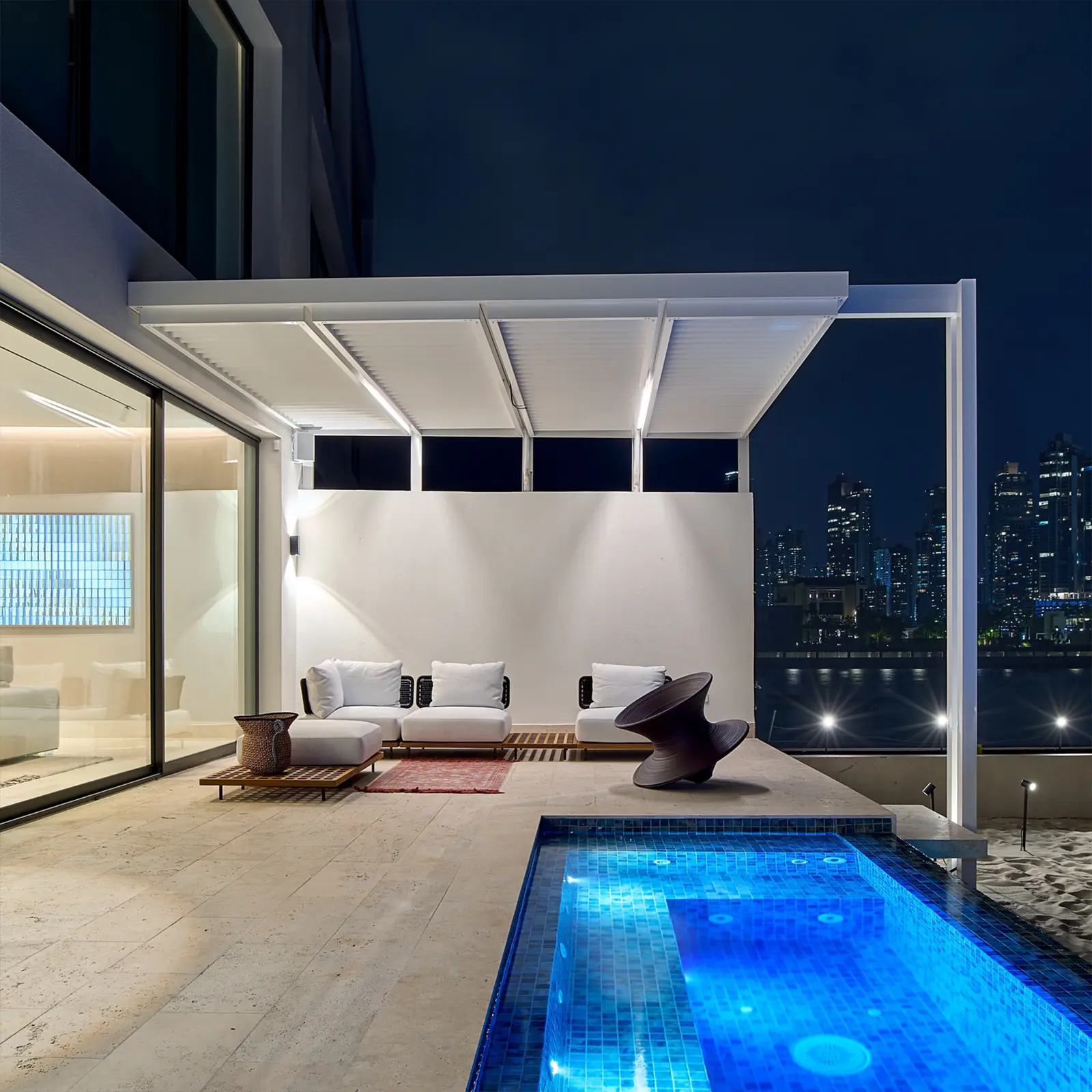
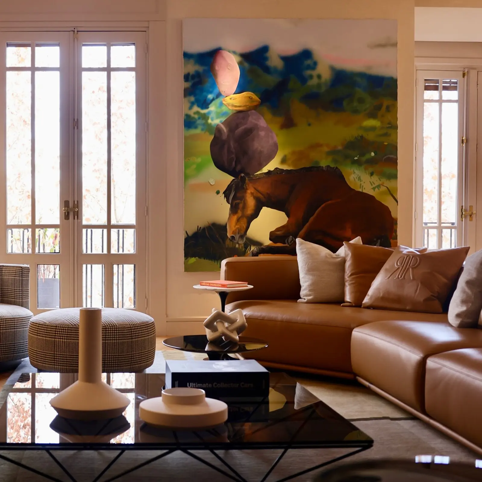
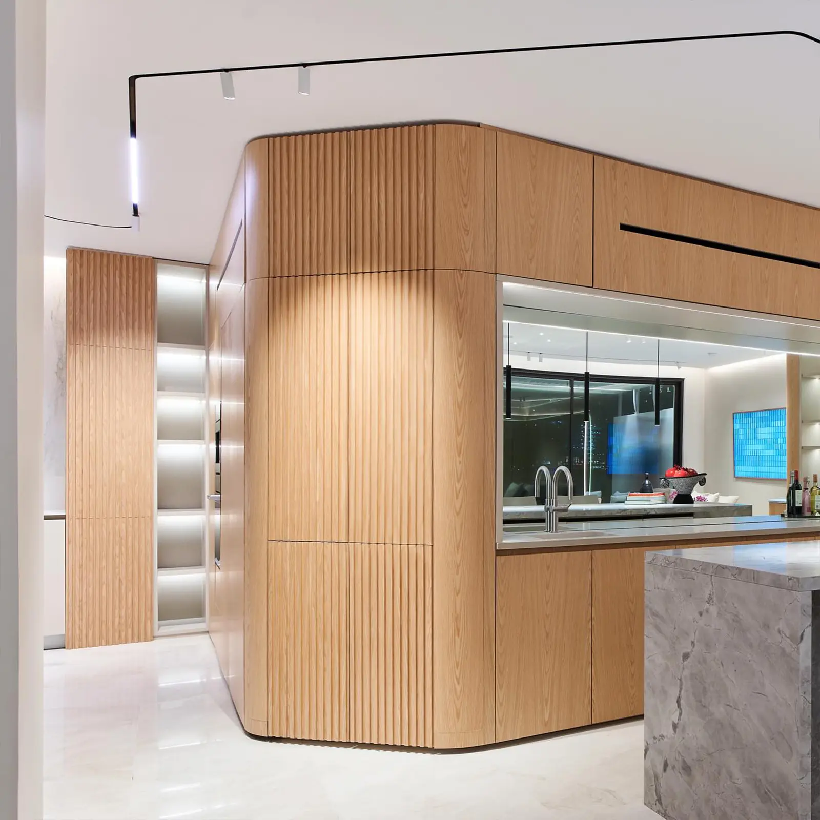
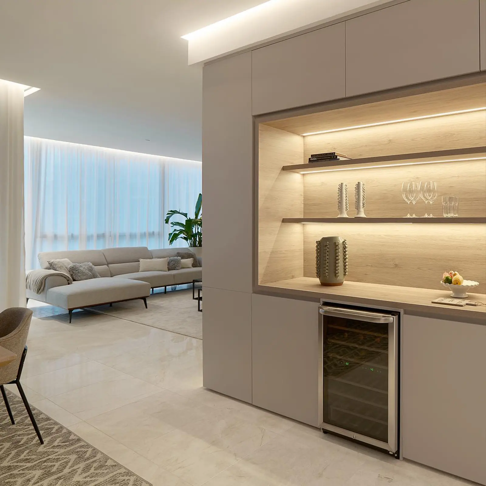
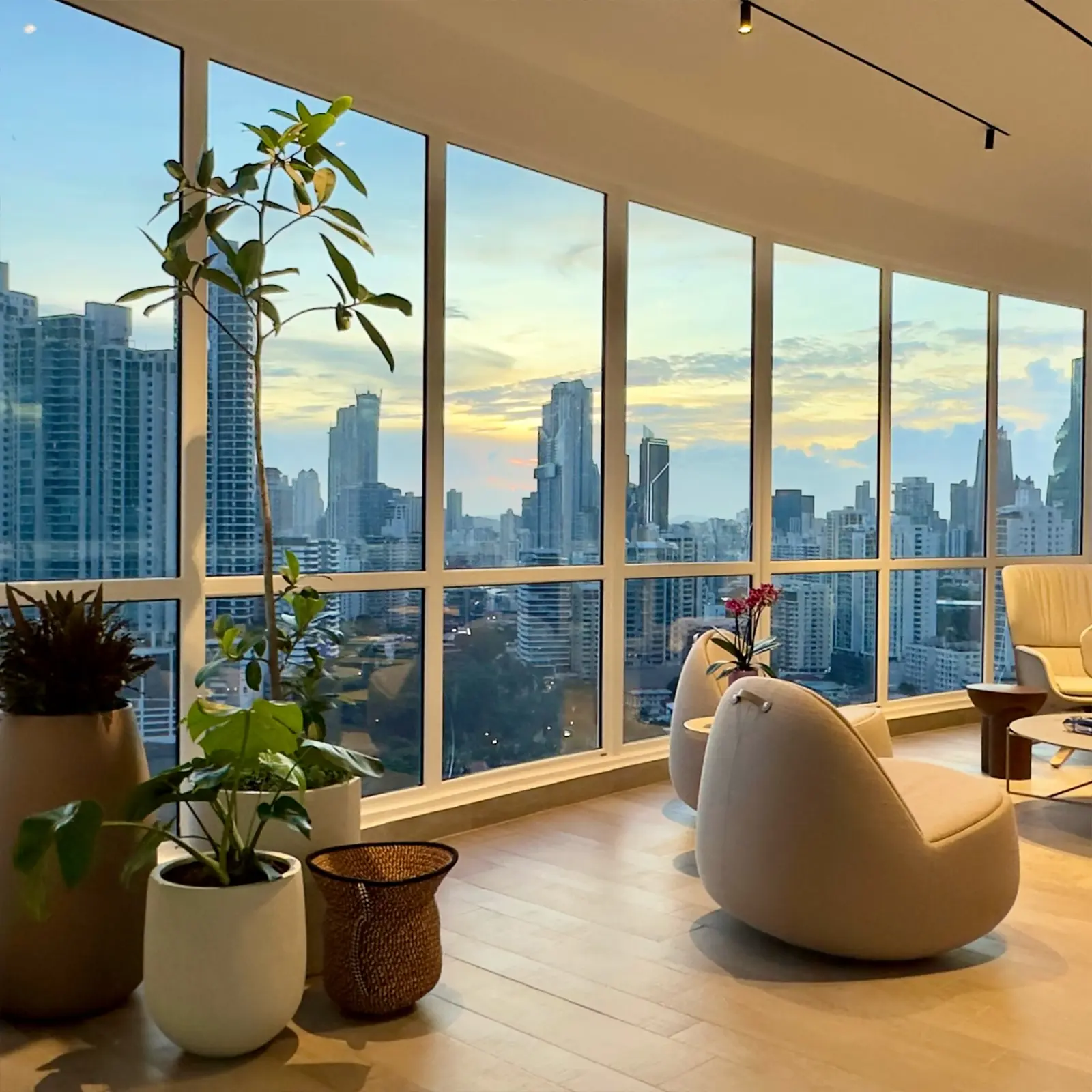
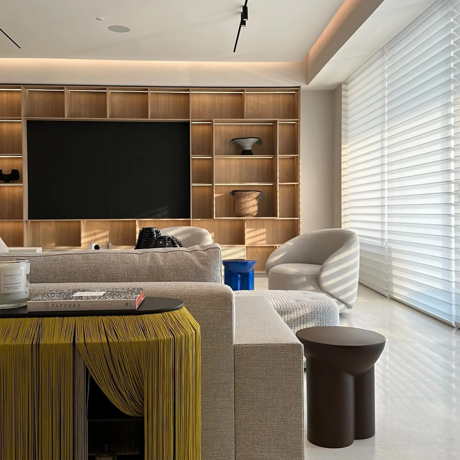
This identity was designed to be as modular and expressive as Nacho's spaces. Built from a series of simple geometric forms, the identity subtly constructs the initials of his studio — while also evoking the structure and proportion found throughout his interiors.
Much like his design work, the identity isn’t static. It expands, contracts, and reconfigures to suit different uses — adapting to product packaging, spatial signage, and printed materials. This flexibility reflects Nacho’s dynamic process and his ability to move confidently between bold, textured maximalism and serene, minimal luxury.
The result is an system that’s responsive, and as thoughtfully constructed as the spaces it represents.
Created in collaboration with graphic designer, Karla Stelling, from MOD INK.
Continues to attract bold, design-driven clients

